Walker Evans’ American Photographs: the bullet points, for idiots, like me.
When I announced the ongoing series I’m running of book talks on photographers and their key books, I promised to write up at least a one page essay, or something to that effect on the photographer, and the book, much in the same vein of a “What I Learned Shooting.” Like that series this shouldn’t be taken too deeply - I’m no expert and these are essentially my personal cliff notes, because I need to actually write out and think out anything before discussing them. Feel free to drop a comment if you have corrections or counterpoints - or just email me.
So now that I’m done the preamble, I’ve broken down my essay/recap/notes into a few segments, starting with:
History:
American Photographs was the first solo exhibition of photography at the Museum of Modern Art. Evans was the primary curator of the exhibition, though he worked closely with Kirstein on finalizing his image selection in the exhibition, and later the book. This seems to have played a huge role in setting up the Museum as sort of the de-facto “Church” of photography in the US. Along with helping establish MOMA, the book was also an early lynchpin of the american photobook tradition, per Galassi. The book, and exhibition first ran in 1938.
Technical Notes:
Evans used an 8x10 view camera for the entire book. While this is not particularly impressive on it’s face - the book itself is not particularly large, so we can’t really appreciate the full size of the plates - even as contact prints - it is quite impressive in the first half the book where evans manages to capture quite a few candid moments with a strong degree of - a fact that Kirstein acknowledges in his essay that comes with the book.
Context of Book, Notes on Style and Construction:
Evans was noted for his commitment to documentary photography, and as one can readily see in the book itself the vast majority of the images were made from 1929-1936, across the Eastern US - Up and down the coast, and deep into the south. Newhall states that while Evans had a great eye for images, and created them consciously, many of the images were stronger in composition than the simplest possible document - though Evans frequently did employ very head on and straightforward compositions throughout much of the book.
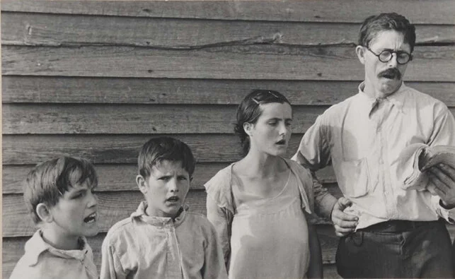
The book is set into two halves - the first focusing largely on the American Populace, their local environments and scenes, and features which they surrounded themselves with. While many of the images are strict portraits of the scenes shot head on, when Evans steps out to document people, particularly in their environment, it tells a distinct story of people’s relationship with each other, and their place. Evans seems to have a particular fascination with advertising, both the ads themselves and how they’ve aged, as well as the placement of advertisements within those settings. Much of the best or most informative work in the first half are Evans’ environmental portraits - tying the scenes he documented to the people. This isn’t to say that his straight forward portraits are bad by any stretch, but that they don’t contain as much pure data or context as the environmental portraits. There are some vernacular landscapes in this first half, as well as interiors, but unlike the later landscapes, the factories, tenements and houses, these photos are very much portraits of place rather than comprehensive “landscapes.”
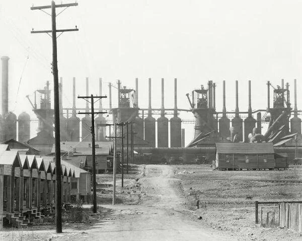
Newhall says of the second half that Evans was attempting to create “an Indigenous American Landscape.” Though, personally I’m a bit loath to say indigenous, as the book documents construction on the American, largely due to non-indigenous settlers. As previously mentioned these photos are more in the traditional landscape arena - and read much more as surveys of place or constructed photos. That said, the second half does reference the first half when the Evans documents many of the houses, and their architectural details - though I suppose these houses and their details make up the firmament of the towns and landscapes -
Many of the landscapes, and beyond contained in the second half of the book are of towns, and dwellings, and have more layered or complicated compositions than the first half - I believe this in part due the nature of landscape photography - unmoving, allowing the photographer to adjust and construct a frame based on their own needs - which Evans was not intrinsically against - though that approach did run contrary to much of his straight on mentality that he employs in the first half. I suppose landscapes which don’t move, and aren’t direct documents like many of the pure portraits, and there’s nobody to manipulate. The other half of this is that many of the landscapes and cityscapes that Evans photographed were themselves complicated, or more complicated than their surrounding environment. In the end, this tends to suggest Evans views a sort of odd entanglement between Americans and their environment - perhaps via the towns themselves or in some cases the job sites that overshadow the town and their environment.
Influences, Descendants, and Contemporaries:
(Walker Evans)
Timothy H. O’Sullivan: O’Sullivan was a photographer during the Civil War, then went on to to document the west as a surveyor - I believe that, referencing the Beaumont Newhall quotation again, Evans takes influence perhaps indirectly throughout the second half of the book. Evans uses more contorted views of his landscapes where O’Sullivan’s are often very flat - and his images tend to give equal importance to everything in the frame - which makes sense given that he’s photographing essentially purely nature and natural topographies, which necessitate equal importance. That’s not to cut down the aesthetic importance of O’Sullivan’s Landscapes.
Robert Adams: Most likely the quickest “descendent” I could come up with - Adams’ work often dealt with similar entanglements between human suburban settlers and their topographies, and many of their compositions are really similar. Though Adams was much more the naturalist, where Evans focuses more on the human aspect.
Henri Cartier-Bresson: Largely a contemporary, though they did overlap in new york - they both focus on similar subjects though their approach or fundamental viewpoint is wildly different. I believe Newhall noted HCB as being distinctly whimsical or french, as opposed to Evans’ simpler more straightforward approach. Bresson did have some landscapes and urban scenes, but they don’t tend to get quite the focus Evans puts on his.
Dorothea Lange: Lange was a fellow FSA photographer, though she leaned more towards people - and her constructions are more graceful, and less forceful. If you’re reading that as a put down, you’re an idiot. I’m tired and haven’t gotten a good book of hers yet, but I’m going off what I can easily google, because she’s frequently checked as a contemporary of Evans’.
Walker Evans
For those like me - the intellectually disinclined (dumb observations):
1. The book is much smaller than I’d imagined. It’s a bit disappointing, because many of the images would likely benefit from a bigger display size, especially in the back half
2. The images throughout the book are relatively high in contrast - not comically so, though.
Softer contrast seems to be a relatively recent movement in photography.
I wonder when it became a “thing?”
3. Evans isn’t completely committed to sharpness, I believe he was a part of the “straight photography movement, and was a hardened documentarian, but a few of the images throughout the book are a little soft, showing a bit of motion.
If you’ve read this far - thanks for reading, I hope you found it useful, or if not useful entertaining, or just got a good hate read out of it. If you liked it, consider grabbing a zine in the shop, or donating (via the donate button) to us so we can keep the website up. We also are on patreon.


