The Seven Essential American Photobooks:
Andrew D. McClees / @andrewdmcclees
Editorial Assistance from: V. Bird
I came to photography from the outside - I didn’t go to undergrad for photography, nor was I raised around a lot of art. Most of my schooling and career was based in film and television - not fine art or photography. After exiting the film and television industry I found out about bookfairs and the photobook medium, which has become the sole driving force in my life. While the community is friendly enough, I have found that there is a lack of a definitive, widely accessible list on what the most essential photobooks is, for someone looking to get into the art and history of photography and photobooks; not just recent releases (there are plenty of year end lists from the last few years for that).
I’m not terribly well versed in European (though it strikes me that the UK (and it’s photography) is a world separate from Europe (- look out for a possible UK version of this list) or Japanese photography (again, would love to make another list for that) - which seem to be the other “great” photographic canons from my (relative) layman’s perspective. So I decided to focus on what I know most and put together a list of single-photographer books, or monographs, covering most of American photography over the last 90~100 years. That should (hopefully) serve as a friendly entry point to any absolute beginner or outsider.
A Quick Disclaimer: I picked these books because of their widespread availability (ie you can still purchase them without searching much, if at all — also most of these books typically hovered around the $40-50 dollar mark, and can be found cheaper if used, or on sale) and the general consensus around them as widely influential works. There may well have been better books from each era/style but only few books have really stood the test of time, and made as big an impact at the time of their first release as the ones I’ve listed here (or get name-checked as frequently). Another factor was the consensus around a book being the singular “best” or “most important” by an individual photographer. For example: there are twenty plus Ansel Adams books but no clear consensus on which of his books is best, or even if one of those books made an impact at the time of release. I also run into similar problems with Winogrand, Friedlander, and even Dorothea Lange. By the time you hit Weegee’s “Naked City” you’re off the beaten starter path (though all of those photogs probably deserve a dedicated followup in some sort of crime/street/midcentury primer).
So, here we go:
American Photographs - Walker Evans, 1938 (MoMA)
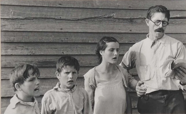
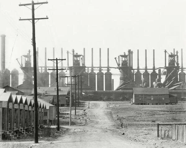
For my money American Photographs is “The Granddaddy” of all American photobooks: it was the first big name book that received a large printing and a lot of widespread fanfare. American Photographs is notable for being the first solo photography show ever at MoMA (The Museum of Modern Art). Photographs is a comprehensive collection of Evans’s work from 1929 through the 30s and 30’s documenting America growing, changing, suffering through, and recovering from the Great Depression. Evans became so renowned for his approach as an individual that he was asked to go document the USA for the Farm Security Administration. This is where modern American photography begins. His approach, known as “straight photography,” applies “maximum detail, definition, and brilliance” - Beaumont Newhall) has been the de-facto mode for most American documentary photographers who came after him. Evans’ approach to the urban landscape specifically is a clearly visible influence on later entrants on this list. If you’re interested in learning more about American Photographs, I wrote an “idiot guide” to the book here.
Photographers influenced by Evans: Literally everyone. William Eggleston, Stephen Shore, Fred Herzog, Robert Adams, Alec Soth.
The Americans - Robert Frank, 1959 (Steidl)
I suppose it should be unsurprising that an article centering on American photography would end up with multiple books with “America'' in the title. Whereas American Photographs documents the Depression, The Americans is the first great work of post-war photography. Robert Frank’s masterpiece takes the form of a long, brutal, road-trip travelling coast-to-coast documenting all of America with an unflinching eye. Frank was uncompromising and he took square aim at life in the US, along with many of the hypocrises he saw on his trip. Frank set the standard for modern street photography with this book - and it still holds up today as a definitive moment in American photography. Multiple (differing) editions have been released subsequently, but Frank himself has made the changes in each one; and his final edit, the current Steidl edition - is excellent.
Buy the current Steidl edition here.
Photographers influenced by Frank: Lee Friedlander, Garry Winogrand, W. Eugene Richards
Willam Eggleston’s Guide - William Eggleston/John Szarkowski - 1976 (MoMA)
While it wasn’t the first exhibition of color photographs at MoMA, Eggleston's Guide was the first showing of color photographs by a solo photographer. Despite this honor, Eggleston himself did not curate, or seemingly seek to publish, The Guide. That herculean effort, and the acceptance of color photography in art, was spearheaded by MoMa director of photographs, John Szarkowski. Surprisingly, this exhibition was met with dismissive, even vitriolic, criticism from the photographic art establishment. However, because of the popularity of the exhibition with average museum-goers, the book (technically a gallery catalog for the exhibit) reached wide circulation. The Guide is an expressionistic document, there’s a clear sense of humor at work, and the book is just what it advertises: a “Guide” of sorts to Eggleston’s Southern locales (Memphis, TN + Mississippi - distinctly through his own eyes) and its inhabitants. The Guide is the first real step into photographic worldbuilding through the use of “broken” or “enigmatic” narrative structures. The “broken narrative” style is an approach heavily built on by many photographers who came after Eggleston. Definitely a book for fans of southern gothic style (whether you’re a photographer or not).
Photographers influenced: Sally Mann, Alec Soth
Diane Arbus: An Aperture Monograph - Diane Arbus - 1979 (Aperture)
The monograph covers most of her portraiture work centering on so-called “misfits'' -- frequently the LGBTQ community, nudists, and the handicapped. That said, it’s worth pointing out that (while Arbus is the first to put many of her subjects on film) her approach is often indelicate. She treats her subjects as objects of interest, and/or perverse fascination, rather than as people. This is spoken about at length by Susan Sontag in On Photography (which, while not a photobook, I would recommend reading). Arbus plays with the square format -- off kilter compositions, wide angle lenses, and striking high contrast (amplified by a flash) create a distorted, almost grotesque, aesthetic objectification of her subjects. A quick warning: the terms used for LGBTQ and handicapped folk in the book are extremely dated (and possibly triggering). These terms were acceptable at the time of the book’s initial publication and have been preserved in successive editions. While problematic, the work in the book remains spectacular, groundbreaking even, and is 100% worth viewing or studying -- even if it ultimately does not meet our current standards of sensitivity in 2021.
Available from Aperture Directly (usually) or elswhere.
Photographers influenced: Nan Goldin, Sally Mann, Bruce Gilden
Uncommon Places - Stephen Shore - 1982 (Aperture)
Shore’s most famous quote about his approach is “... [he] takes photographs to explain, understand, and view the world around [him] ...”. In doing so Shore documents as a form of expressionism. He creates intricate, nuanced urban and vernacular landscapes with such clarity that it’s as if they were something you had seen yourself. Despite this electrifying compositional style, Shore’s eye for the banal is largely unprecedented (especially in color). Fine Art Photography had no real interest in the banal, before Shore appeared on the scene with Places (and it’s companion, American Surfaces). Places is the first major advancement of landscape photography in color that’s not strictly about traditional rule of thirds compositions, loud “expressive” tonalities, and impressing upon folks the majesty of nature.
Places breaks the mold of landscape photography in that it resets what it means to be a landscape photographer: you don’t just have to have slabs of landscape (traditional or vernacular), heaped on top of each other. You can actually be a human being, interacting with the world and people around you (this is why documenting banal moments and scenes is important),while noticing those vistas. For example: the portraits in Places are highlights in the book just as often as the landscapes are ( even though that’s not typically first and foremost when people talk about the book). If you’re going to buy an edition of the book, the 2005 Aperture “Complete Works” is considered the ‘canon’ version, currently.
Buy Directly from Aperture (well, currently out of stock, but you can find it elsewhere - though I’m Aperture’ll reprint again it soon enough.)
Photographers Influenced: Todd Hido, Joel Sternfeld, Tim Carpenter, Andrew D. McClees
The Ballad Of Sexual Dependency - Nan Goldin - 1986 (Aperture)
Nan Goldin breaks down many of the walls of journalistic objectivity set up by her forebears and blends expressionistic diarism with brutal, uncut slabs of realness from her life. Ballad dwells in the early 80’s queer and hard drug scenes in New York’s East Village and frequently features Goldin as a subject in her own photographs (in a way completely new to the documentary format). Originally Ballad was a slideshow set to music for her and her friends’ private consumption but the show gained notoriety and was masterfully adapted to a photobook shortly after. This allowed the body of work to be seen and appreciated by an international audience. As a result Ballad ended up as a huge influence on the American/Western “snapshot” style, disaffected fashion photographers, and the many “gritty” color photographers who came of age after its publication. Nan herself has continued to be extremely active as a photographer, and in the art world as a whole, to this day.
Available here directly from Aperture.
Photographers influenced: Alec Soth, Stacy Kranitz
Sleeping by the Mississippi - Alec Soth - 2004 (MACK Books)
Sleeping by the Mississippi is almost the perfect natural follow-up, and counterpoint, to Ballad. Soth spent years driving up and down the Mississippi River living out of his car documenting the people and places he found (primarily in rural America) in a similarly diaristic fashion to Ballad. Whereas Goldin is loose and fluid, Soth takes a much more formal tone (both in terms of composition and approach) because much of, if not all of, Sleeping was shot on 8x10. This slowed down the process of photographing-- forcing the photographs to be much more staid and reserved. However, much like Arbus and Goldin, Soth achieved a high degree of intimacy with his subjects for a relative outsider. He was often able to photograph people who would not normally allow themselves to be vulnerable for the camera in their own interiors. Sleeping by the Mississippi had a huge impact, and has largely set the tone of photography for the mid ‘00s up until today, both in approach and in visual style. There have been two prior printings on Steidl, but the current edition on MACK books has two additional photographs.
Available directly from Mack Books - Signed, even.
Photographers influenced by Alec Soth: I can’t think of specific examples, but I’ve heard it namechecked enough to put it here. Would welcome specific descendents.
Bonus Round: Compilations and History Books
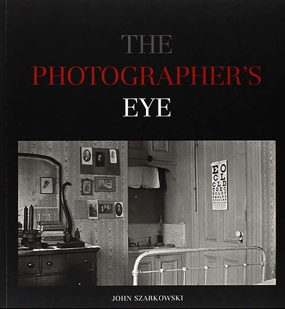
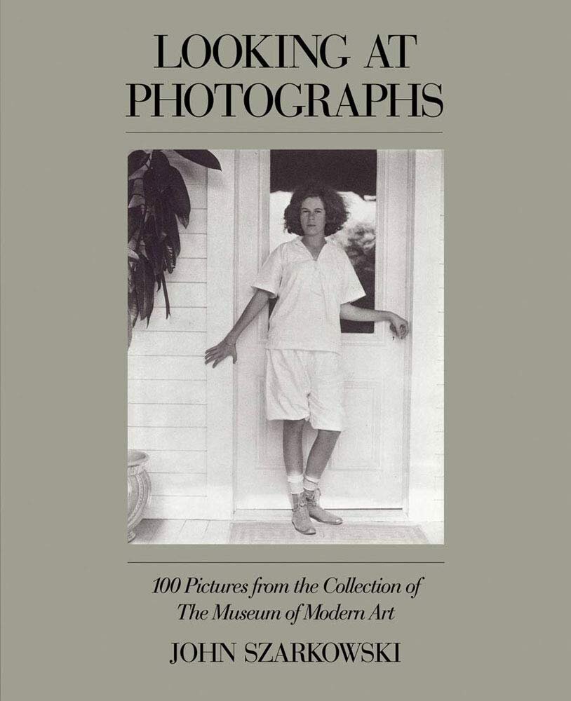
The Photographer’s Eye + Looking At Photographs - John Szarkowski - 1966 +1973 (MoMA)
The Photographer’s Eye is a great comprehensive photo essay. It’s a large compilation of different photographers’ work (which was originally based on a gallery show at MOMA Szarkowski curated) with a wonderfully written opening essay. As a result it’s a great pictographic survey of both early and mid-century photography. Photographer’s Eye is an easy, casual way to consume a lot of photography without digging too far into history, or text, as well as a great study in the power of curation.
Looking at Photographs fills a similar function to Newhall’s History of Photography (but does it better). Rather than inundate the reader with academic text, Szarkowski pairs photos with a brief writeup on why the photograph is important and the relevant technical advances made with it. If you wanted a reference guide, I’d recommend Looking at Photographs over The Photographer’s Eye (even if it’s less touted).
Grab Photographer’s Eye here, and Looking at Photographs here.
So that brings to a close the seven essential , or most influential, photobooks, in the American canon currently (all of them largely documentary works). Each of them has had a profound impact on photographers that came after it and their influence will likely continue to be felt for years to come. Looking forward I expect more books to populate the list -- partially because I missed spots (like fashion and portraiture) but also because photography is a living, breathing art form. There will inevitably be more photographers whose books and influence is felt and seen widely and I want to make sure to be able to include them on this list
If you have questions/comments/better suggestions for a more accurate fleshed out list, drop me a line at McClees@frozenwaste.land - I’m more than happy to take suggestions and contributions.
If you’ve found this helpful, or think it’s useful, share it! - if you feel like helping the website stay running - pick up a zine from the shop!


